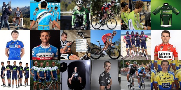
(featured image courtesy of Inrng; see editor’s note below)
AG2R
I have a grudging respect for a team who, in the face of universal bitching over their corporate colours, have refused to bow to peer pressure and face 2014 with a raucous ‘Fuck you! MOAR BROWN!’. This strategy might prove a little dangerous, as none of the riders will be targeting their respective National Championships for fear of ending up riding a season dressed like Mr Hankey the Christmas Poo.
Most likely to be seen: doing absolutely nothing all year then winning a middle-week stage of the Tour.
Astana
What happens when you take the meanest motherfuckers from the hardest European cycling gulags, and dress them for season upon season in turquoise and lemon? This is the psychological experiment the Kazakh Mini-Cyc has been conducting sine 2007, with mixed success. This year they’ve ramped up the turquoise to try and make Nibali really angry.
Most likely to be seen: frantically deleting emails.
BMC
It looks like the budget for developing a new kit design was blown on Cadel Evans’ HRT and Taylor Phinney’s Brylcream allowance. The once edgy and stylish BMC get-up is now looking a little tired. Consider this a written request for a re-boot in 2015.
Most likely to be seen: very quietly replacing the old guard with a new generation.
Belkin
Although I’m totes over the rake of black ‘wish we wore Rapha’ kits that have cropped up for this year, I like the simple style of this one. And I like that Belkin are pioneering a brave new ‘Your Name Here’ sponsorship strategy for the major races. And, because I’m nothing if not contrary, I like the Belkin green with the Bianchi Celeste on the bikes too, so ner*.
Most likely to be seen: balls deep in a blood feud with Movistar.
*The Cyclist wishes it to be known that he has attempted to point out to me just how utterly wrong I am about this.
Cannondale
Everyone’s favourite bum-pinching, beard-dying, Slovakian mean green biking machine and his henchmen keep their 2013 look. At least it’s not black.
Most likely to be seen: with matching collars and cuffs.
Europcar
Very minor changes from the 2013 jersey for Europcar’s step back up to the top ranks, sticking with the dark green ‘n’ black. Following the sad demise of Euskaltel, I’ll personally be looking to Europcar to take up the mantle of peloton skittles. And I’m pleased to report they’re already starting well on this track with Voeckler’s Australian collarbone antics.
Most likely to be seen: wearing spotty shorts in July.
FDJ
It is with a heavy heart I still mourn the loss of the perv-tastic white wet-weather danger kit, with FDJ continuing to opt for MOR mid-bleu. Quel ennui.
Most likely to be seen: in a Bastille day breakaway.
Garmin
Last year’s Gar-meh has had a welcome facelift, with a particularly cheeky rear view accessorised with the team’s new spirit animal, the WWF Panda. We’ll have to wait for 2014’s doping scandals to blow up to see if the patented Vaughters Teflon coating from 2012 and 2013 has been applied to this year’s jerseys.
Most likely to be seen: accompanied by a man in a panda suit. At all times.
Giant-Shimano
For a rebrand of last year’s most exciting team, this is almost criminally dull. I am, however, prepared to award points based on the fact that Giant stepped up to title sponsor at short notice. I expect better in 2015, and by better I mean flames and guns and ninjas and shit.
Most likely to be seen: on all of the podiums, and most of the podium girls.
Katusha
More white, less red. Katusha peaked in 2011 with a kit featuring the outline of the spectacular and iconic St Basil’s Cathedral – because why would you not have that on a jersey? It rocks So. Hard. Sadly, now replaced with the Russian letter ‘Oooosh’. Which does not rock so hard.
Most likely to be seen: throwing everything behind J-Ro.
Lampre- Merida
The switch from a sky blue to a navy blue base renders this notably less of a hot mess than last year’s kit. Lampre, now dangerously below their UCI regulation Italian Team Hot Mess quota, look to have been forced to rectify the situation with a hot mess of a (rumoured) late addition to the team roster.
Most likely to be seen: a bloody mile off.
Lotto-Belisol
A retro-fabulous complete makeover. Well-played, you big sexy Belgian bastards. You’ll still peak too early in the season though.
Most likely to be seen: Tearing it up at the Tour…. of Qatar.
Movistar
No change, yet again for Movistar. Can’t say I really blame them, though this is still looking good. All eyes on the Quintanas (Quintanae?) for 2014.
Most likely to be seen: climbing the fuck out of shit.
Omega Pharma Quick Step
This is hands down the worst kit of the year, with zero redeeming features. The blue piping made me do a bit of a sick in my mouth. I can only assume it’s to encourage Cav over the line in first so he can get the disgusting thing off. I won’t look at it any more.
Most likely to be seen: attempting a classic shake-and-bake in the sprints.
Orica Greenedge
Those dirty sweet Aussies keep their green and blue good looks for another year, albeit with a few minor tweaks. Gorgeous. I’m pretty sure these bad boys can do no wrong.
Most likely to be seen: checking the height of their bus.
Sky
Based on the 2014 ‘Black is the new Blue’, the team the others want to look like. We’ve all seen the stripper skinsuit and it can’t just be me who’s imagining team camp Brazilians and enormous breakfast bust-ups over who has to go behind Stannard in TTT practice. Given the massive public enthusiasm for the Rapha/Sky hookup, this year the range has been expanded to include a fully poseable My Little Eisel complete with realistic brushable hair and Rapha branded Limited Edition Team Issue Dream Diary*.
Most likely to be seen: furiously denying team rifts.
*Seriously. I made that up. They’d sell out if they did though.
Tinkoff-Saxo
When banks collide. Last year’s corporate clusterfuck lives to fight another day, and its still fugly as hell. Look deep into Alberto’s eyes in the publicity shots and you can hear his desperation. “Help me. Help me.”
Most likely to be seen: having a massive social media meltdown
Trek
A kit that literally screams “We are desperate for a headline sponsor!.” Even the perpetually grinny Fabian Cancellara is struggling to look happy about this. It’s just so goddamn dreary.
Most likely to be: Something – Trek this time next year.
* * * * *
Editor’s note: For an excellent reference of what the 2014 peloton will look like, head over to Inrng’s blog post on team jersey fashion that’s a nice companion to this piece.






No Comments